3 Reasons Why DiGi WWWoW Awards Website Sucks
Have you check out the Malaysia DiGi WWWoW Internet Awards and submit your entries?
I like the idea to acknowledge Malaysians’ online works. But I don’t like the WWWoW website. Here are 3 reasons why it sucks (and how to improve).
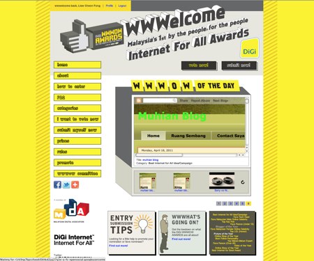
1. Yellow. Yellow! YELLOW!!
I know it’s organized by DiGi and “yellow” is the company’s colour. But, do you really need to color the whole page in YELLOW?
Take a look at the DiGi’s own official website. It looks great and only logo and menu bar are yellow color!
I believe the WWWoW team could do a better web design.
2. iFrame?!
Also, why use iFrame in the “WWWOW of the day” showcase?
The small box couldn’t fit in a whole page. Scroll up & down, left & right to see the blog? No, thanks.
Thumbnails should be used in the showcase. Please refer to some CSS showcase sites.
3. Duplicated entries…
Oh dear, please monitor and remove those duplicated entries.
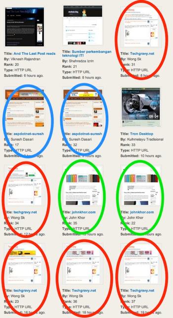
In the above screenshot, those circled are the duplicated entries. Only 6 out of 12 entries are unique!
A simple duplicated URL check should be done when user submit their entry.
Do you agree/disagree? Tell us in the comment.
Disclosure: LiewCF Tech Blog has an entry in the WWWoW for “fave tech head” award. Click here to vote.